Top 5 Kevin Tong Prints
By Ben Brooks
We here at Addicted2Print are starting a new series called "The Past and Future" where we look back at a specific artist's work and spotlight our five favorite prints from their career, "The Past," and then provide a list of five prints we hope they tackle somewhere down the line, "The Future."
In light of his upcoming gallery show, I decided to take a look back at Kevin Tong's work from the past few years. In this installment, I'll be listing on my five favorite prints from the past.
We're just focusing on film prints for this list, so don't get mad if I leave out some of his art and gig poster work! Let's get started!
5) The Bride of Frankenstein (2012)
[caption id="" align="aligncenter" width="228"] Bride of Frankenstein[/caption]
My first choice, Bride of Frankestein, is a little bit of an under appreciated print. Mondo has had the Universal Monsters' license for over three years now, which means that most properties have been interpreted multiple times by multiple artist. In fact, some artists have even tackled the same subject twice -- see, for example, Laurent Durieux's two pieces for the "Creature." In light of that history, it's understandable why some prints may get lost in the shuffle while others are highly celebrated.
In the case of the Bride, the undisputed classic is the work of Martin Ansin, who coincidentally is Tong's upcoming Mondo gallery mate. I'm sure Ansin's work will be covered in his own "Past" piece, but let me briefly say that I think it deserves all the allocates lumped on it, and I don't see any future Mondo Bride print knocking it off its perch in the future. Beyond Ansin, there have also been prints by Olly Moss and Jason Edmison, both of which are very nice. However, Tong's work is my favorite non-Ansin interpretation.
If you've never seen this print in person, you're doing yourself a disservice. The metallics and colors are incredible. The large, red heart serves to light up the entire piece and it's a perfect and bold choice for the material. Typically, we see the bride in black and white, specifically with the contrast of her black hair and white bolt running through it. Here, her heart and the glowing red color is the focal point of the print. It's a risky approach, but it's what I love about it. She's not just a monster -- she's human. And what better way to demonstrate that than focusing on her heart.
The print may never be worth as much as others on this list, or others in Tong's portfolio, but it's priceless to me.
4) The Iron Giant Variant (2011)
[caption id="" align="aligncenter" width="277"]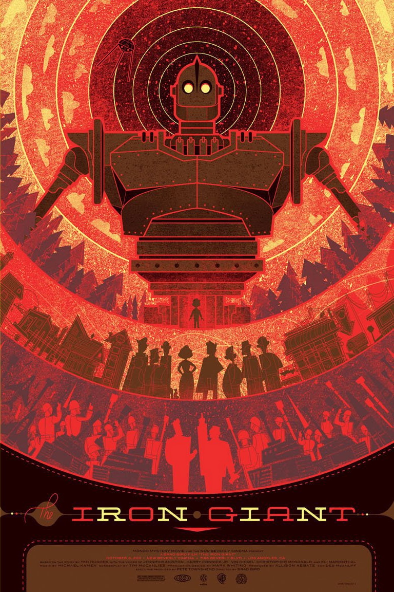 The Iron Giant Variant Edition[/caption]
On a pure visceral level, upon first glance, this print pops. In the simplest terms: it just makes you stop and pay attention. The reds, oranges and yellows work perfectly together. However, when you stop to really look at it, there's a lot more going on than great colors.
There's a circle going around the print, and in each layer there is a particular segment of characters from the film. There's the military on the bottom, town residents in the middle, and Hogarth on top. It's a beautiful way to represent a film that is ultimately about the relationship between a young, lonely boy and a lone alien robot who is not as different from his young friend as their exteriors would seemingly dictate.
When you boil it down, it's just Hogarth staring up at the giant, all by himself, while all the other people in the film are beneath them, as they could never understand the relationship that these two unlikely friends have formed.
As for why I chose the variant, it's as simple as liking the cleaner version of the Giant.
3) The Invisible Man (Gold Variant) (2011)
[caption id="" align="aligncenter" width="280"] The Invisible Man Gold Variant[/caption]
When I spoke earlier about Mondo's Universal Monsters Series, I noted that many properties had been tackled multiple times. Well, the Invisible Man has only been tackled by two Mondo artists, and Kevin Tong was the first (Francavilla also did a fantastic print for the property).
Tong's take on the material reminds me of old school poster art, with a touch of comic book styling. The reason I mention comic books is because it almost looks like the front cover of an Invisible Man comic that would be published in the 1950s. The title block is certainly a throw back to when the film was released and provides a great retro-vibe to the print.
The actual illustration here, though, is the star. The line work and sketching are great. There is wonderful detail on full display here that adds to the older feel of the work. We're also treated to a perspective of the invisible man with his wrapping coming undone, as opposed to the more traditional image of his wrapping fully on with glasses on top.
2) A Linch Pin Droid (2010)
[caption id="" align="aligncenter" width="300"] "A Linch Pin Droid"[/caption]
Mondo released a lot of Star Wars prints in 2010. It was a huge license and it resulted in some fantastic artwork. It may have even resulted in the most iconic Mondo Print ever -- Olly Moss' Star Wars Trilogy Set.
If my memory servers me correct, Tong's piece was right before Mondo released the final prints under the Star Wars license. And I'm also pretty sure, I wasn't a huge fan of it. I love R2D2, but I was waiting for something that represented the whole trilogy, not just one character. So in that sense, I kind of wrote it off. Years later, with the entire series being complete and having both Moss and Stout trilogy sets fulfilling my initial desire to have "whole trilogy" prints, my opinion changed drastically.
The print has to be one of Tong's most accomplished from a technical perspective. There's just an incredible amount of detail on display here. The piece slices up R2-D2 and shows you all the intricacies of the character from an unfamiliar perspective. It's almost like a real life sales manual for a droid.
The colors of the print are also outstanding. Tong made a somewhat risky decision in forgoing the iconic and familiar color scheme of the character, and instead taking one of the colors -- blue -- and just coloring the entire character in it. It's not even an accurate representation of the color blue R2D2 sports in the films, but it works perfectly. It makes the image pop off the page and matches well with the green instrument panel-like background.
Here's a print that proves that while you may not initially love a print, with a little bit of time and perspective it may turn out to be one of your favorites.
1) This is Where I Live . . . Lived (2011)
[caption id="" align="aligncenter" width="311"] This is Where I Lived - Inspired by Eternal Sunshine of the Spotless Mind[/caption]
Well, we've reached the number one print on my list, and I have to admit that it may be somewhat colored by my love of the film that inspired it. Eternal Sunshine of the Spotless Mind is one of my favorite films of the last ten years. And in some respects, it probably made me tougher to please because I hold the film in such high regard. But Tong absolutely nailed it here.
What makes the print so great is that it allows Tong to utilize a style we rarely see him employ, one with a more muted color pallet and style, and much simpler and singular imagery than we typically see. Yet, there is so much packed into that facially simple image.
Howeverm because this film means so much to so many people, I thought it would be appropriate to let the artist, via mymodernmet, explain what it meant to him, and his inspiration behind the piece:
"'The illustration is basically a scene from the movie when he (Jim Carrey's character) is remembering his childhood,'" 'he says.' "'I love that line, 'That's Where I Live..Lived' because essentially he forgot that it was a memory. He was so immersed in the emotions and the environment. In the end, even the most traumatic experiences just become memories.'"
"'The house is part of the environment and it changes as Joel inhabits different memories. The only constant is him and Clementine and eventually even she fades away. This could be viewed in two separate ways. Either the memory is collapsing or it's assembling as he goes deeper into it.'"That's all for the "Past." Join me soon for my "Future" piece on Mr. Tong.
Leave a comment