Top 5 Ken Taylor Prints
By Ben Brooks
In honor of Ken Taylor's upcoming Mondo Gallery show, I'm taking a look back at his previous work, "the Past," and also looking forward to prints I hope to see him tackle down the line, which will be discussed in the "Future" portion of the piece.
In this installment, I'll be listing on my five favorite prints from Ken Taylor's past work.
I'm just focusing on film prints for this list, and no collaborations, so don't get mad if I leave out some of his other work! Let's get started!
5) Poltergeist (2010)

What's the most iconic image in Poltergeist? The first scene that probably jumps into people's minds is the little girl sitting in front of the television. However, Taylor forgoed that iconic imagery and set out to tackle the film in a more original manner.
The poster does a fantastic job of conveying the mood of the film, without relying on that classic shot. Instead, we get an ominous view of the clouds over the home, using a muted black and green color tone, with one spot of orange to convey that someone is still inside the home. We know there is danger outside, but the protagonist is unaware. As a result, it perfectly evokes the same fear and tensionthe audience feels while watching the film.
4) Metropolis Variant (2013)

The great Stout/Taylor show of 2013 was hyped beyond anything seen before and probably since. And arguably the best piece from the show, and one of the best of Ken's career, was the Metropolis variant.
Although the film has been the subject of countless alternative art prints, Taylor's work here is simply beautiful. Taylor chose to forgo the familiar image of Maria transformed and instead focus on her before her transformation. What also makes it a perfect piece for the film is that it feels like it could have been the original one sheet for when Metropolis was released back in 1927.
3) 20,000 Leagues Under the Sea (2012)
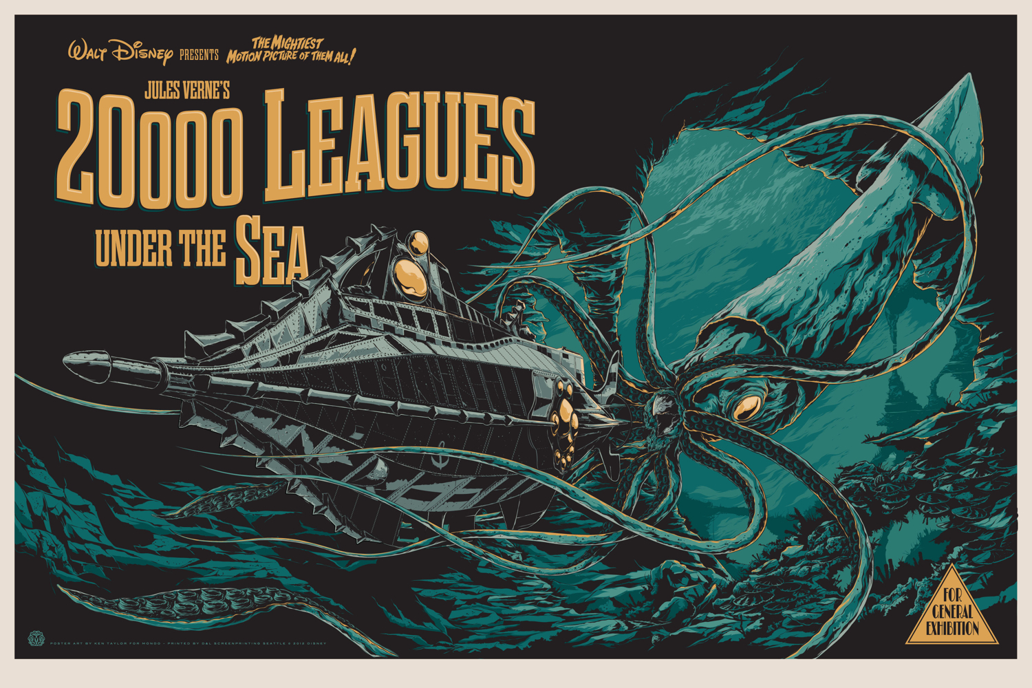
From the picture above, you can tell this is a fantastic print. The detail, the colors, the layout are all perfect. But you have not seen this print until you actually see it in person.
More so than any other print in recent memory, when I received my copy of this I was floored. I had seen the jpeg image and loved it. However, once I unraveled it from the tube, I was floored to see how vibrant the colors were, and how the image popped off the paper. It's beautiful and vibrant in a way that the stock image simply fails to fully convey.
If you're on the fence about this one, grab it. It's a head turner.
2) Halloween (2012)
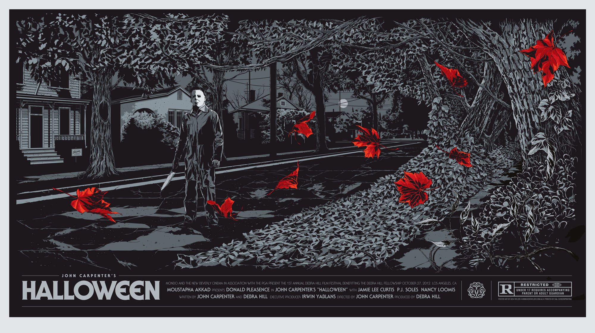
Halloween's inclusion on this list is kind of a sore subject. Although I love the print, I'm somewhat bitter because it was nearly impossible to get. That's because it was debuted at a screening of the film in LA, and was never sold online by Mondo. Except for some AP copies released by Posters and Toys, you either had to be at the screening or buy it on the secondary market.
Putting that aside, I think it's the perfect art for Halloween. The leaves blowing around and Michael Myers standing ominously behind them takes me right back to the film. The image takes something beautiful, that time in the fall when the leaves change colors and are just beginning to drop from the branches, and contrasts it against the sinister Michael Meyer's with a knife lurking in the background.
Additionally, Taylor's decision to forgo color except for the leaves was genius. It works perfectly to accent both the leaves and create a perfect, dark mood for the piece.
1) Alien II (2009)

Ken Taylor made two Alien pieces for Mondo in 2009. There is the Egg, and the Space Jockey pictured above. While both are great, the Space Jockey is the better image, and there hasn't been a better Alien print released since.
One thing we get, which is sorely lacking in Mondo prints now, is likeness. We have the main players beautifully rendered on the left side of the page to go along with the depiction of the Space Jockey. The green and blacks are perfectly suited for the film, and are used with precision.
Simply stated: all other Alien pieces pale in comparison to Taylor's Alien II.
Leave a comment