If you missed it yesterday, we ran down the first 5 of our favorite prints of the 2013. See what made the rest of our list, including our favorite film print of the year!
5. Gabz - Inception
Grzegorz Domaradzki, or Gabz as he commonly referred to, had a break through year in 2013. Gabz had been producing work for several years, but it wasn’t until his Predator piece that everyone started taking notice. Like Inception, that Predator piece was commissioned by a small group of collectors, which meant it was not available to the general public. However, we all benefited from the collaboration as it pushed Gabz into cleaner, less scratchy line work when compared to his earlier efforts. This style was then duplicated in his Inception and Pacific Rim prints with incredible success.
Although we enjoyed both Predator and Pacific Rim, we chose Inception as our favorite of the bunch because of the clever way it was laid out. The main target in the film is Cillian Murphy’s mind, which is also used as the layout of the print. Each level of the print corresponds to a dream implanted in his mind during the film. An Inception print that has line work similar to Ansin and is clever like a Moss makes this one of our favorite prints of 2013.
While we wish there were more than 10 of these, we look forward to seeing more from Gabz in 2014.
4. Laurent Durieux - Jaws
As discussed in part one of this list, it can be extremely hard to create alternative artwork for a film when the original artwork is considered iconic. There is no better example of that than Jaws. The original one-sheet for the film is widely recognized as a classic, and that posed a big problem for Mondo. Most prior attempts at cracking the case failed because they would ultimately revolve around the famous image of the shark and boat. But Mondo didn’t want a retread; they wanted something completely different than the original. Cue Laurent Durieux, who came up with artwork where the water was barely even visible.
In what turned out to be a brilliant idea, Durieux chose to forgo all that fans would expect from a Jaws print: the water, the shark, the boat, and any sign of carnage; and, instead, focused on the unsuspecting people on the beach, seemingly having a wonderful day in the sun completely unaware of the terror that awaits them. The only reference to the shark is the clever placement of the fin on a beach goer’s umbrella.
The print is ominous and wonderful because it teases what we all know is awaiting those innocent people on the shore. And like much of Spielberg’s original film, the print let’s the idea of the killer shark be the main driving force behind the audience’s fear without actually showing it. Add all that to the brilliant depth and details in Durieux’s work, and you have a classic.
Laurent Durieux is one of our favorite artist’s at Addicted2Print, and we’re anxiously awaiting the debut of his gallery show in February 2014.
3. Rich Kelly - Beasts of the Southern Wild
When Gallery 88 in LA announced that they were teaming with the Academy Awards for FREE officially licensed posters for the best picture nominees, they labeled it a “game changer.” Whether it was, in fact, a game changer is up for debate. What seems indisputable, though, is that the collaboration produced some beautiful artwork. From Mark Englert’s Django to Olly Moss’ unbelievably clever design for the official poster for the Oscar, there was no shortage of work to admire. However, our favorite piece was Rich Kelly’s Beasts of the Southern Wild.
Here’s a print that anyone could appreciate without having any knowledge of the film. It’s absolutely stunning, and catches your eye immediately. That being said, knowledge of the film will greatly enhances one's appreciation of it.
The layout of the print is extremely clever, with the bottom portion being the top when flipped upside down and the top being the bottom. Water, which is really an antagonist in the film, is used to divide the top and bottom of the print. And it seems like Kelly is depicting the more fantastical “bathtub” on the top of the print, whereas the bottom seems like it is a depiction of the outside world. The bathtub portion is underwater, much like the bathtub in the movie ultimately is left, and the only thing connecting the top and bottom of the print is Hushpuppy’s hand and the bottom of the truck. It’s like she is reaching out trying to recapture the bathtub from above, much like she continually tries to do in the film.
The bottom characters are also drawn in Kelly’s more typical style (see his Django print), whereas the top portion is drawn with smoother line work and in a more realistic style. There is also a tremendous amount imagery from the film packed into the top of the print, including the fantastical boar behind it all.
While this print may not be ranked as our favorite of the year, once we get this low on the list, it’s basically splitting hairs. This could easily be number one. We just hope that Mr. Kelly is given more opportunities to tackle some major properties in the future.
2. Martin Ansin - Taxi Driver
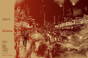
In our book, Martin Ansin had a big year in 2013. There’s been a lot of talk about his line work and style changing over the course of the last few years, with people debating which style is better. To us, Ansin’s output this year proves that no matter what the style, his work is rarely rivaled. His newer style was on beautiful display in his interpretation of Man of Steel, a print that we could have easily included on this list. And his prints for Iron Man 3 and Elysium are no slouches, either. However, it was his print for Taxi Driver, in which he employed his older style, that was our favorite.
Rumor has it that this print was actually created a while back for a potential Mondo Mystery Movie in New York City. But when the NYC theater was delayed, those plans changed. Ultimately, the print was released over a year after it was created as an event exclusive in Austin. Regardless of how it got here or when it was created, it is damn near perfect.
First, they got De Niro’s likeness, which was huge. But beyond that, the print completely nails the vibe of the film. The gasoline filled city affecting part of the print is not only accurate in a literal sense, and expertly executed, but it also creates a dream-like atmosphere reminiscent of the often debated, ambiguous ending of the film. Then you have Travis wandering down the street, represented in a completely different way than anything or anyone else in the print. He’s the outsider. The man by himself in this city. Just like he is in the film.
Add all that to the fact that the print is flawlessly drawn and you have an instant classic that collectors will be hunting down for years to come.
1. Aaron Horkey - There Will Be Blood Variant
We know. We know. Big surprise, right? Even though this was probably the biggest and most hyped film print of the year, it earned every word of praise lobbed its way, and then some.
It was rumored that this project took over 100 hours to complete. Based on the detail present here, we believe it. Horkey hand draws his work and it can be tremendously time consuming. But it also makes his prints seem extremely authentic and unique. Horkey’s ornate drawings cover nearly every spare inch of the page here, except for those spaces where small pieces of the film are inserted. A Horkey staple is also on full display here, as even the text is insanely detailed and elaborate.
The concept of the work is also outstanding. It mirrors paper money or a stock certificate and it’s currency — oil — is front and center. The small Plainview Seal on the bottom, and the Eagle at the top, also help to perfectly evoke the concept of currency. That concept is also why we chose the variant over the regular version because the green inks are reminiscent of our own paper money — especially when viewing the print in person.
This kind of work in both it’s detail and execution is simply unrivaled by any other alternative film print artist working today. It's just undeniably unique. What’s incredible is that he released the gorgeous Graveyard and Two Towers prints this year, as well. All we know is that we can’t wait to see what’s next from Mr. Horkey.
See you back here next year!


Leave a comment